


Lookin’ Sharp
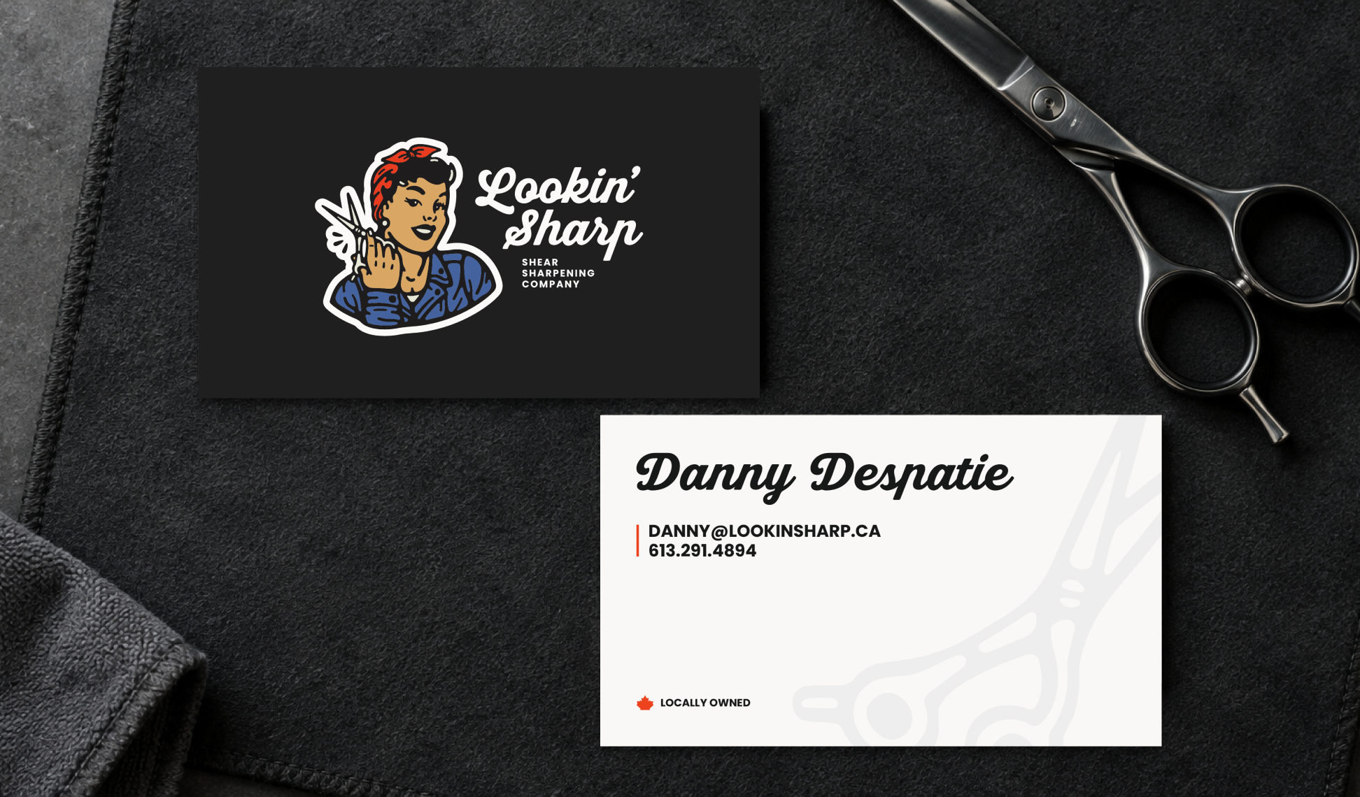
A confident visual identity for a shear-sharpening company. Expressive illustration, distinctive lettering and practical printed materials give a specialist service a character of its own.
Visual identity / Logo system / Print collateral
The challenge
A specialist sharpening service needs to communicate craft and precision while making a memorable first introduction. The identity brings the tools of the trade into a more expressive visual language, with a mark that can hold attention and a practical system that remains useful in everyday print.
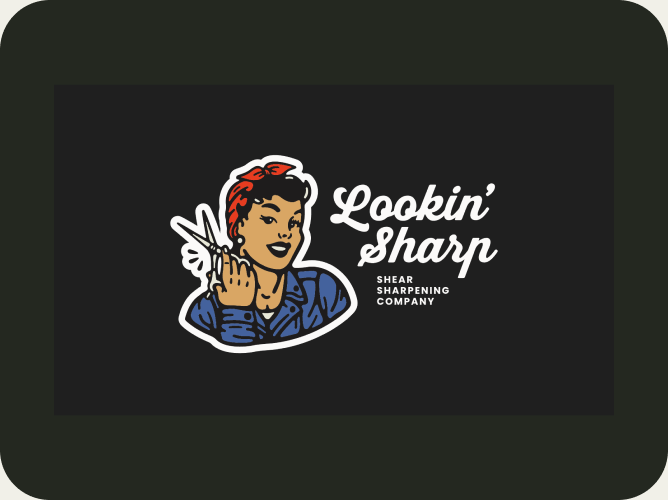
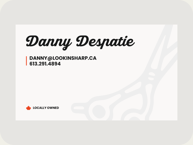
The illustrated identity and expressive lettering sit alongside clear service and contact information on the approved business-card artwork. The front and reverse work as a coordinated set, with the identity leading the introduction and a restrained shear motif supporting the contact side.
The result
A visual identity with an illustrated mark and wordmark, supported by business-card designs and prepared print and finish artwork. The result gives Lookin’ Sharp a distinctive, usable set of brand assets for its everyday introductions.
Ruffin’It Retreat & Spa
Explore the Next Project